Web design principles are practical rules for creating websites that are clear, usable, accessible and effective. They help visitors understand what a business offers, find the information they need and complete important actions without unnecessary friction.
A high-performing website goes further than looking polished. Its design supports measurable outcomes such as faster task completion, stronger engagement, more qualified enquiries and higher conversion rates. The most valuable web design and UX design principles are therefore the ones that improve both the visitor’s experience and the website’s commercial performance.
Web design principles make websites easier to understand and use. For a website to perform well, its structure, content, navigation, speed, accessibility and calls to action must work together to help visitors complete their goals.
Nine Web Design Principles at a Glance
What Are Web Design and UX Design Principles?

Web design principles are guidelines for organising a website’s visual, structural and interactive elements so visitors can understand and use it effectively. They influence layout, navigation, typography, colour, responsiveness, accessibility, speed and content presentation.
UX design principles focus on the complete experience a person has while trying to achieve a goal through a website, application or digital product. They consider whether the journey is clear, efficient, predictable and satisfying from the visitor’s perspective.
The two disciplines overlap considerably. Effective web design applies UX thinking to the practical decisions that shape a website.
UX Design vs UI Design
A website can have an attractive user interface while still delivering a poor user experience. A carefully styled enquiry form will not perform if it asks for unnecessary information, produces unclear errors or is difficult to complete on a phone.
What Makes a Website High Performing?
A high-performing website helps the right visitor complete the right action efficiently. The action may be purchasing a product, submitting an enquiry, booking a service, comparing options or finding reliable information.
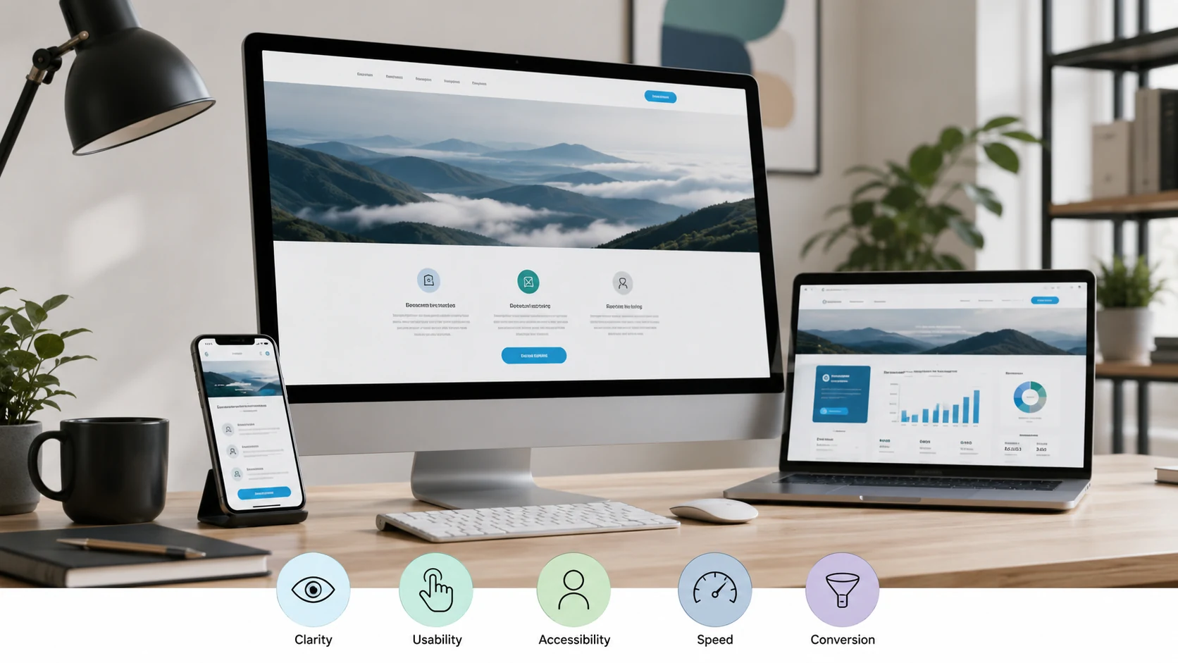
Website performance should be evaluated through several connected outcomes:
- Clarity: Visitors quickly understand the offer, audience and next step.
- Usability: Important tasks can be completed without confusion.
- Technical performance: Pages load quickly, respond promptly and remain visually stable.
- Accessibility: People can use the website across different devices, abilities and input methods.
- Trust: The design and content reduce uncertainty at important decision points.
- Conversion: The experience guides qualified visitors towards a valuable business action.
This creates a more useful standard than judging a website by its appearance alone.
The Hackd Performance UX Framework
At Hackd Growth, website experience can be evaluated through five connected questions:
- Intent: What is the visitor trying to accomplish?
- Clarity: Can they understand the offer and available choices?
- Friction: What makes the task slower, harder or less certain?
- Confidence: What information does the visitor need before acting?
- Measurement: How will the team know whether the experience improved?
This framework prevents design decisions from being based entirely on preference. Every major change should address a user need, remove a measurable obstacle or strengthen an important stage of the conversion journey.
1. Design Around User Goals
The first principle of good web design is to organise the experience around what visitors need to accomplish, not around the company’s internal departments or assumptions.
A visitor rarely arrives wanting to “engage with a brand ecosystem”. They usually have a specific task, such as:
- Comparing services
- Checking whether a product meets their needs
- Understanding pricing
- Finding delivery or location information
- Requesting a quote
- Completing a purchase
- Confirming whether a business is credible
Identify the most important user tasks before creating the sitemap, page layout or visual design. Interviews, customer support questions, website search data, sales enquiries and analytics can reveal what visitors actually need.
How to apply this principle
- Identify the primary audience for each page.
- Define the main task that audience needs to complete.
- Arrange information in the order users need it.
- Remove content that does not support the task.
- Test whether users can complete the journey without assistance.
Metric to watch: Task completion rate.
A page may generate substantial traffic while still performing poorly if visitors cannot complete the task that brought them there.
2. Make the Value Proposition Immediately Clear
A visitor should be able to understand what the business offers, who it serves and why it is relevant within the first meaningful section of the page.
The main heading and supporting copy should answer four questions:
- What does the business provide?
- Who is the service or product for?
- What problem does it solve?
- What should the visitor do next?
Avoid opening with broad claims such as “transforming possibilities” or “creating tomorrow”. These statements sound polished but give users little information.
A stronger opening communicates the offer in concrete language. Instead of saying “We build powerful digital experiences”, a development company could say:
Conversion-focused websites and scalable applications built for performance, growth and long-term maintainability.
That wording communicates the service, approach and intended outcome.
The Axe Labs website and growth project demonstrates this principle in practice. Clearer messaging, site structure, conversion flow and tracking were treated as connected parts of the digital experience rather than isolated design changes.
How to apply this principle
- Use a descriptive H1 rather than a vague slogan.
- Place the main benefit close to the primary heading.
- Use one prominent action for the page’s main goal.
- Explain specialist language in plain terms.
- Support claims with proof, examples or specific details.
Metric to watch: Primary call-to-action click-through rate.
3. Create a Strong Visual Hierarchy
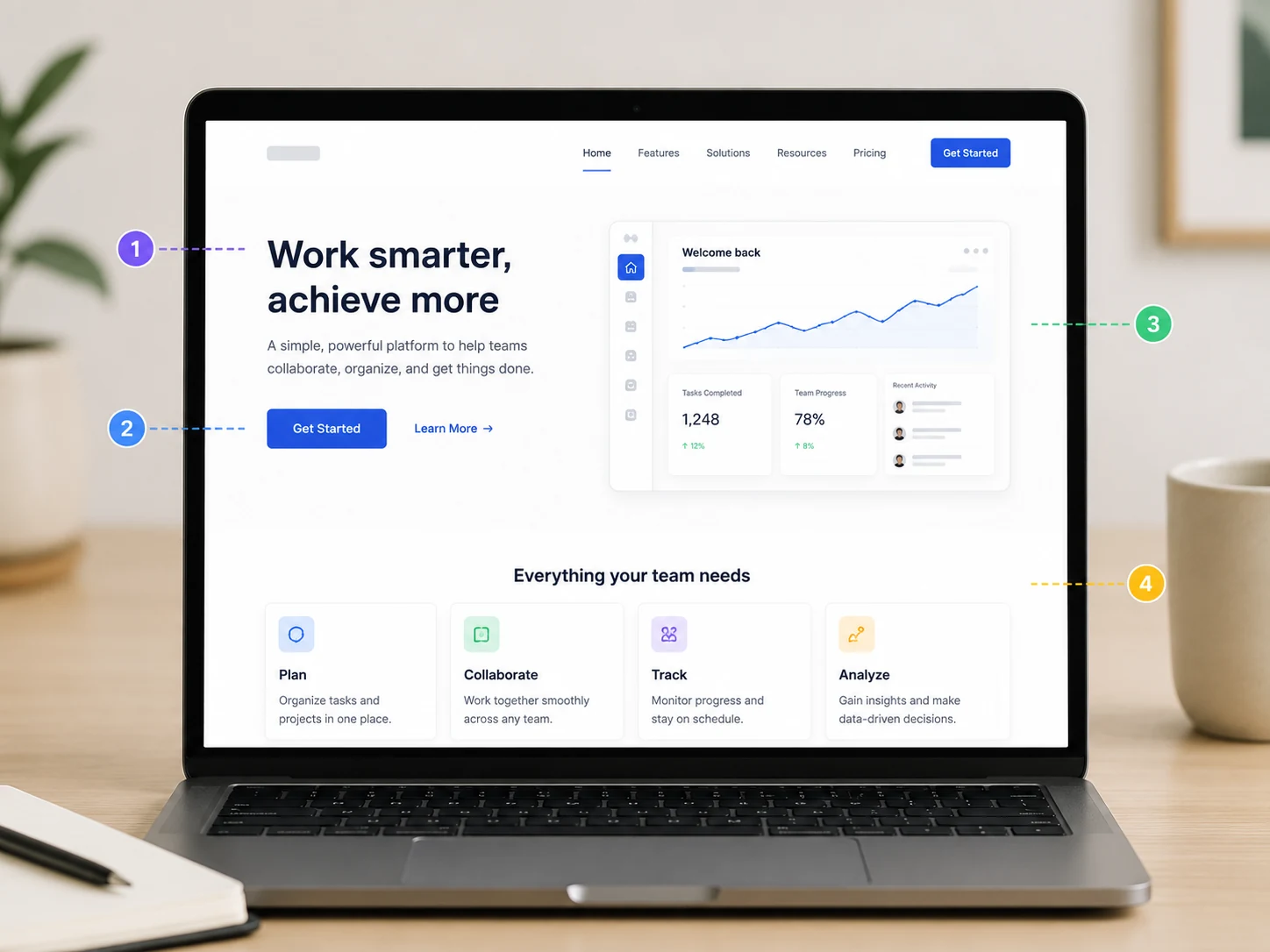
Visual hierarchy directs attention towards the most important information and actions. Without it, visitors must work out what matters by scanning every element on the page.
Hierarchy is created through:
- Heading size
- Content order
- Spacing
- Contrast
- Position
- Alignment
- Grouping
- Repetition
- Button prominence
Important information should not rely on size alone. A large heading with vague wording may attract attention without helping the visitor.
Nielsen Norman Group’s research into web reading patterns shows that people commonly scan rather than read every word. Clear headings, short sections, informative link text and well-structured lists make important information easier to identify.
How to apply this principle
- Give every page one clear H1.
- Use descriptive H2 and H3 headings.
- Place important information early.
- Break long sections into manageable paragraphs.
- Use white space to separate unrelated ideas.
- Make the primary action more prominent than secondary actions.
- Avoid giving several elements equal visual weight.
Metric to watch: Scroll depth and engagement with priority content.
Do not interpret low scroll depth automatically as failure. A visitor may find the answer near the top and complete the desired action immediately.
4. Keep Navigation and Information Architecture Predictable
Navigation should help visitors form an accurate picture of what the website contains and where they are within it.
Unusual labels may feel creative, but visitors should not have to interpret terms such as “Possibilities”, “Universe” or “Solutions Hub” when they are looking for services, products or contact details.
Good navigation uses labels that match the language customers already understand.
How to apply this principle
- Use descriptive menu labels.
- Group related pages into logical categories.
- Keep primary navigation focused on important destinations.
- Add breadcrumbs to deep content structures.
- Maintain consistent menus across the website.
- Include site search where large product or content libraries require it.
- Make the logo return visitors to the homepage.
- Ensure the mobile menu preserves important destinations.
During the Splendour in Stone website project, product discovery, project presentation and enquiry pathways were treated as part of one customer journey. The experience needed to support homeowners, designers and builders without forcing every audience through the same information path.
Metric to watch: Task success rate.
Secondary indicators include internal search use, navigation exits, menu interactions and the paths visitors follow before converting.
5. Reduce Cognitive Load
Cognitive load is the mental effort required to understand information, compare options and decide what to do next.
A website increases cognitive load when it presents:
- Too many competing actions
- Dense, poorly organised content
- Unclear button labels
- Unnecessary form fields
- Inconsistent page structures
- Complex pricing without explanation
- Large menus without meaningful grouping
- Error messages that do not explain how to fix the problem
Reducing cognitive load does not mean removing useful information. It means presenting the right information at the right stage of the journey.
A technical service page may require detailed specifications, but the visitor should not have to process every specification before understanding what the service does.
How to apply this principle
- Break complex processes into clear stages.
- Group related information.
- Use descriptive labels instead of instructions users must remember.
- Show advanced details only when relevant.
- Limit forms to information required for the next step.
- Use sensible defaults and autocomplete.
- Explain errors beside the affected field.
- Avoid unnecessary pop-ups and interruptions.
Baymard Institute’s checkout usability research consistently shows that unnecessary checkout complexity contributes to abandonment. The same principle applies to lead forms, booking systems and onboarding flows.
Metric to watch: Form completion rate.
Also monitor field-level abandonment, form errors, completion time and the difference between form starts and successful submissions.
6. Design for Real Mobile Behaviour
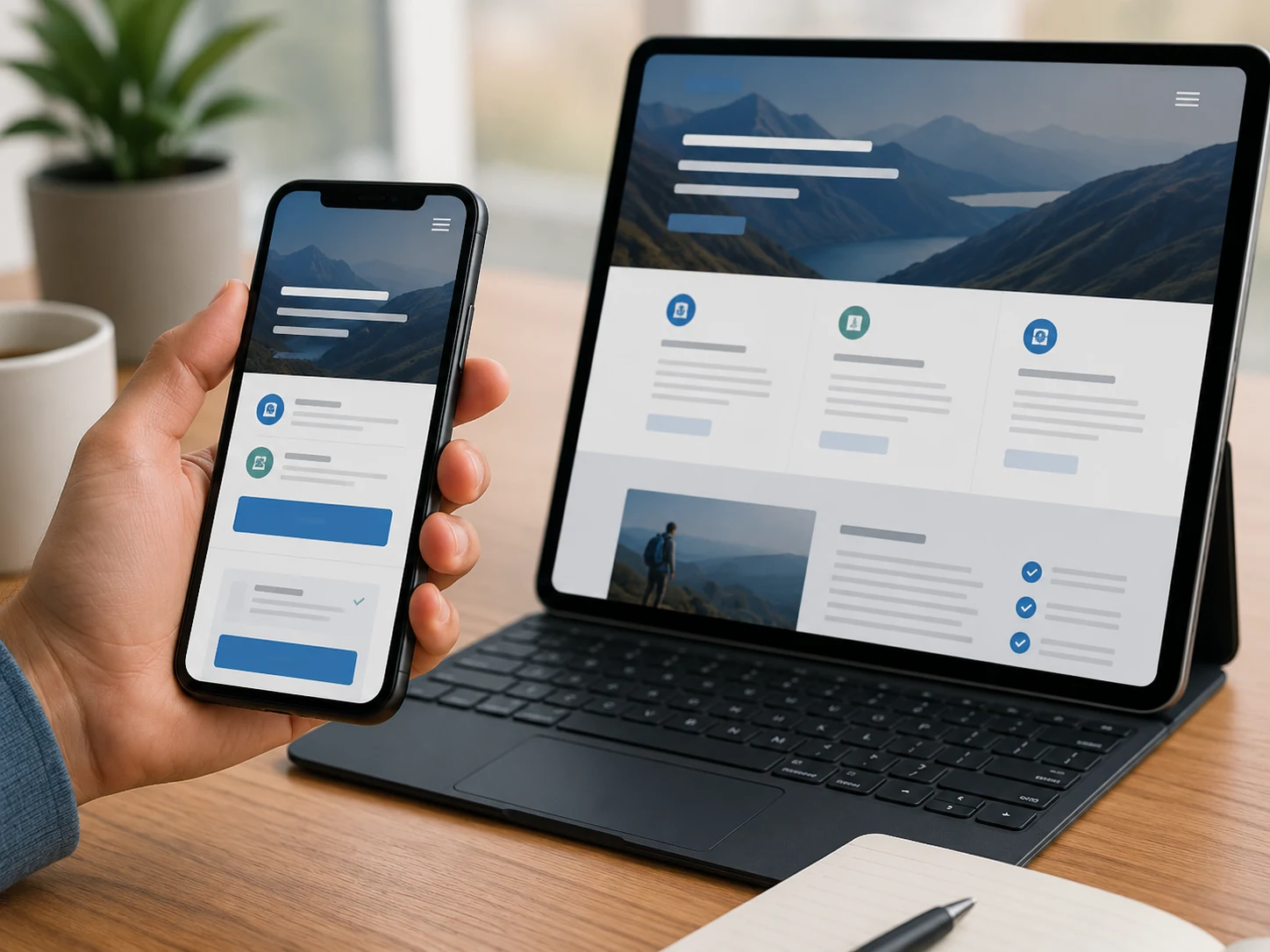
Responsive design is not simply shrinking a desktop page until it fits a smaller screen. Mobile users have different space constraints, input methods, connection conditions and levels of attention.
A mobile interface should prioritise:
- Readable text without zooming
- Tap targets that are easy to select
- Short, well-labelled forms
- Fast access to important information
- Simple menus
- Stable page elements
- Content that fits without horizontal scrolling
- Buttons that are not blocked by banners or pop-ups
Do not remove essential content from the mobile version merely to make the page shorter. Use accordions, tabs and progressive disclosure where necessary, but keep the main information accessible.
How to apply this principle
- Start layout testing at narrow screen sizes.
- Test navigation with one hand.
- Use the appropriate keyboard type for form inputs.
- Make phone numbers and email addresses actionable.
- Avoid hover-dependent interactions.
- Check pages on real devices, not only browser previews.
- Review the complete path from landing page to conversion.
Metric to watch: Mobile conversion rate.
Compare mobile and desktop task completion, form abandonment and engagement. A large performance gap may indicate usability problems rather than lower mobile intent.
7. Treat Speed and Stability as UX Requirements
Website speed affects how quickly users can view content, interact with the interface and move through the conversion journey.
Google’s current Core Web Vitals guidance recommends:
- Largest Contentful Paint: Within 2.5 seconds
- Interaction to Next Paint: Below 200 milliseconds
- Cumulative Layout Shift: Below 0.1
These metrics evaluate loading performance, responsiveness and visual stability.
A Google-commissioned study conducted by Deloitte examined more than 30 million sessions across 37 brands. It found that improvements of 0.1 seconds across measured mobile speed metrics were associated with stronger progression through several conversion journeys. Retail participants also recorded higher conversion rates and average order values. The results are detailed in the Milliseconds Make Millions study.
How to apply this principle
- Compress and correctly size images.
- Use modern image formats.
- Limit unnecessary scripts.
- Delay non-essential third-party resources.
- Reserve space for images, ads and embedded elements.
- Improve server response times.
- Cache static assets.
- Remove unused code.
- Test performance on mobile connections.
Speed should be considered during design and development, not treated as a final technical clean-up.
Metric to watch: LCP, INP and CLS.
Bounce rate, conversion rate and page progression can provide additional context, but Core Web Vitals should not be treated as the only measure of website quality.
8. Build Accessibility Into the Interface
Accessible design allows more people to perceive, understand and operate a website, including users who navigate with keyboards, screen readers, voice controls or other assistive technologies.
The Web Content Accessibility Guidelines 2.2 organise accessibility around four principles: content should be perceivable, operable, understandable and robust.
Accessibility improvements frequently strengthen usability for all visitors. Clear labels help screen-reader users, but they also help anyone completing a form quickly. Captions assist people with hearing loss as well as users watching a video in a quiet environment.
How to apply this principle
- Provide descriptive alternative text for meaningful images.
- Maintain sufficient colour contrast.
- Use semantic heading structures.
- Ensure every action can be completed with a keyboard.
- Keep keyboard focus visible.
- Label form inputs clearly.
- Do not use colour as the only way to communicate meaning.
- Provide captions and transcripts for relevant media.
- Make touch targets large enough to select reliably.
- Allow users to correct input errors.
Automated accessibility tools are useful for identifying technical issues, but they cannot evaluate the entire experience. Manual testing remains necessary.
Metric to watch: Accessibility audit results and successful keyboard task completion.
9. Use Consistency, Feedback and Trust Signals
Visitors rely on familiar patterns to predict how a website will behave. When similar buttons, forms or navigation elements behave differently across pages, users must relearn the interface.
Consistency should apply to:
- Button styles and labels
- Navigation
- Form behaviour
- Content hierarchy
- Icons
- Terminology
- Error states
- Confirmation messages
- Pricing presentation
The interface should also respond when a visitor acts. A submitted form needs a clear confirmation. A failed payment needs a useful explanation. A loading process needs a visible status.
Trust signals should appear where uncertainty occurs. These may include:
- Reviews
- Case studies
- Clear pricing
- Delivery information
- Guarantees
- Secure payment indicators
- Qualifications
- Contact details
- Returns policies
- Real project examples
Do not place every trust signal in the footer and expect visitors to find it. Position reassurance near the decision it supports.
How to apply this principle
- Use the same term for the same action across the website.
- Confirm when forms, payments and uploads succeed.
- Explain what caused an error and how to correct it.
- Place reviews near relevant offers.
- Show shipping and returns information before checkout.
- Use real team, product and project evidence where possible.
- Avoid unsupported claims and invented urgency.
Metric to watch: Conversion rate and form-error rate.
How to Measure Whether Website UX Is Working
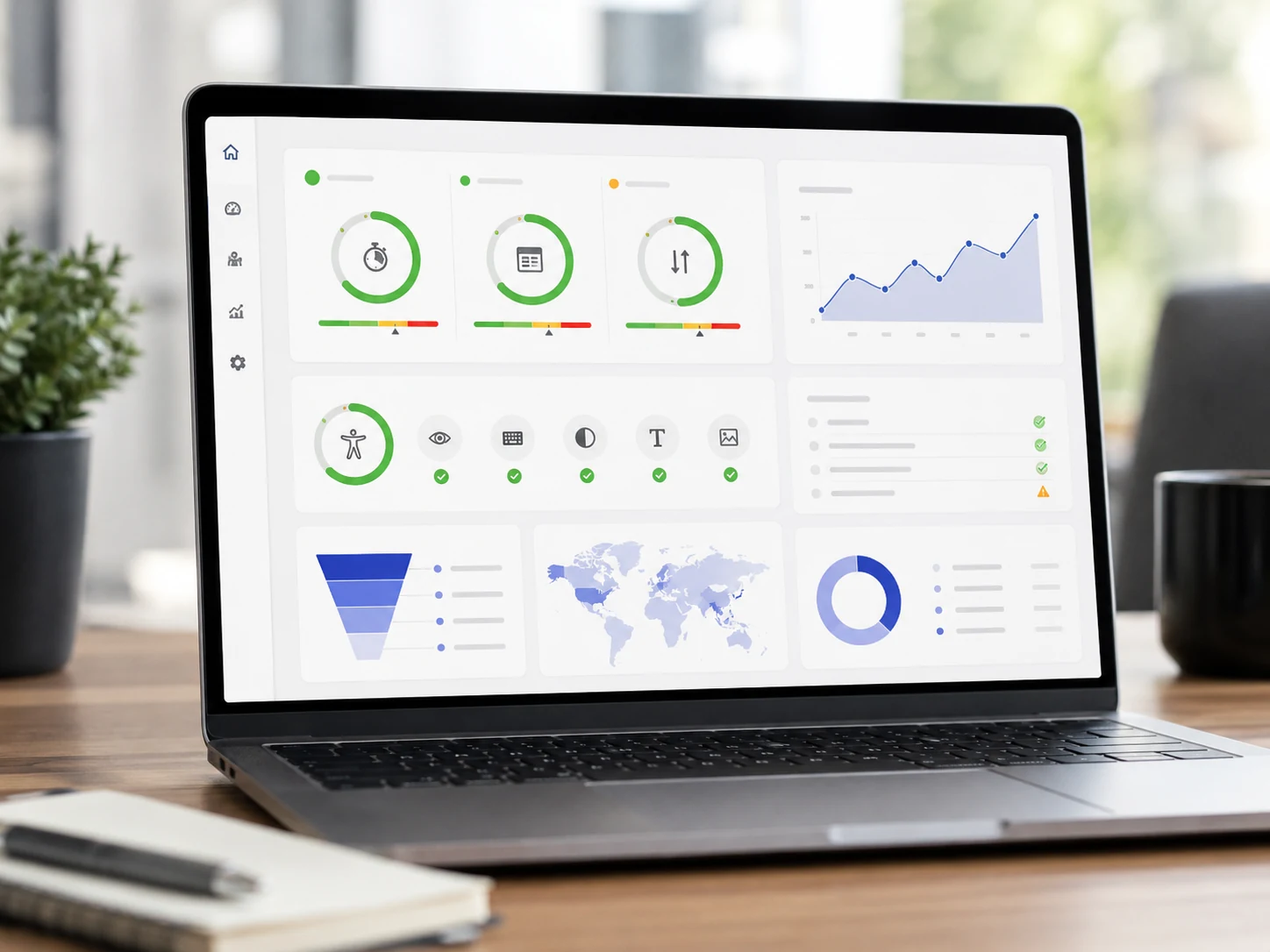
Good UX should be observable through user behaviour and business outcomes. The right metric depends on the purpose of the page and the task being evaluated.
A generic industry benchmark cannot explain every website. A service business, ecommerce store and subscription platform have different user journeys and conversion patterns.
The most reliable approach is to establish a baseline, make a specific change and measure the result against the previous experience. Hackd Growth’s data analysis and behaviour measurement systems are designed to connect tracking with the decisions required to improve funnels and user journeys.
Does UX Design Affect SEO?
UX design can support SEO by improving page experience, mobile usability, content clarity, accessibility and technical performance. It does not replace relevance, authority or high-quality content.
Google explains that its systems consider several signals aligned with a good page experience. Core Web Vitals are used by its ranking systems, but achieving perfect technical scores does not guarantee a top position. Relevance remains essential.
Strong UX can also support organic performance indirectly by helping visitors:
- Find the main content quickly
- Navigate related pages
- Read and understand information
- Use the website comfortably on mobile
- Complete actions without technical problems
- Distinguish useful content from distractions
Website structure, internal linking, search intent and page experience should therefore be treated as connected parts of an effective SEO and GEO strategy, rather than separate projects.
Common UX Mistakes That Reduce Website Performance
- Designing for internal preferences: Decisions are based on what stakeholders like rather than what users need.
- Vague opening messages: Visitors cannot identify the offer or next step.
- Competing calls to action: Several equally prominent actions make the intended journey unclear.
- Hidden navigation: Important pages are placed behind unfamiliar labels or complicated menus.
- Slow hero media: Large videos and images delay the main content without adding enough value.
- Long forms: Visitors are asked for information the business does not need at that stage.
- Low-contrast text: Content looks stylish but is difficult to read.
- Unclear error messages: Users are told that something failed without being shown how to correct it.
- Carousels for essential messages: Important content disappears before visitors can process it.
- Inconsistent components: Similar buttons and controls behave differently across the website.
- Missing mobile testing: The desktop layout is approved without reviewing the complete mobile journey.
- No measurement plan: A redesign launches without a baseline or clearly defined performance indicators.
Website UX Checklist
Before publishing or redesigning a website, confirm that:
- Each page has a defined audience and purpose.
- The main offer is clear near the top.
- The primary action is visually prominent.
- Navigation uses familiar, descriptive labels.
- Headings accurately describe each section.
- Important content is easy to scan.
- Forms request only necessary information.
- Errors explain how to recover.
- The complete journey works on mobile.
- Core Web Vitals meet recommended thresholds.
- Text and interface elements meet accessibility requirements.
- Trust information appears near decisions.
- Analytics track important interactions.
- Performance is compared against a baseline.
- Real users have tested high-value journeys.
Build a Website That Performs Beyond Its Appearance
A high-performing website is not created through visual design alone. It requires a clear understanding of user goals, a strong information structure, accessible interactions, reliable technical performance and measurement that connects design decisions with business outcomes.
Hackd Growth’s web and app development approach combines conversion-focused architecture, performance optimisation, UX design, technical SEO and analytics. Businesses planning a new website or evaluating an underperforming one can start a conversation with Hackd Growth about where the current experience is creating friction.
Frequently Asked Questions
1. What are the main web design principles?
The main web design principles are user-centred planning, clarity, visual hierarchy, predictable navigation, low cognitive load, responsive design, speed, accessibility, consistency and clear feedback. Together, these principles help visitors understand a website and complete important actions efficiently.
2. What is the difference between UX and UI design?
UX design focuses on the complete experience of using a website or product, including research, structure, navigation and task completion. UI design focuses on the visual and interactive components people use, such as layouts, buttons, typography and colour. Strong UI contributes to UX, but it represents only one part of the overall experience.
3. How many UX design principles are there?
There is no single official number of UX design principles. Different frameworks organise them according to usability, psychology, accessibility, interaction design or product development. The best framework is one that helps a team make clear decisions and measure whether users can achieve their goals.
4. What makes a website high performing?
A high-performing website loads quickly, communicates its offer clearly, works across devices and helps visitors complete meaningful actions. Its success should be measured through outcomes such as task completion, qualified enquiries, purchases, engagement and customer retention.
5. How do you measure good UX?
Good UX can be measured through task success, completion time, conversion rate, form completion, error rate, user satisfaction and technical performance. Metrics should be selected according to the page’s purpose and compared with the website’s own baseline.
6. Does UX design affect conversion rates?
UX design can affect conversion rates by reducing confusion, unnecessary steps, technical delays and uncertainty. The size of the improvement varies by website, audience and traffic source, so changes should be tested rather than assumed to work universally.
7. Are Core Web Vitals part of UX design?
Core Web Vitals form part of the technical user experience. They measure loading performance, responsiveness and visual stability. They do not represent the complete experience, which also includes content clarity, navigation, accessibility, trust and task completion.



.png)



.jpg)